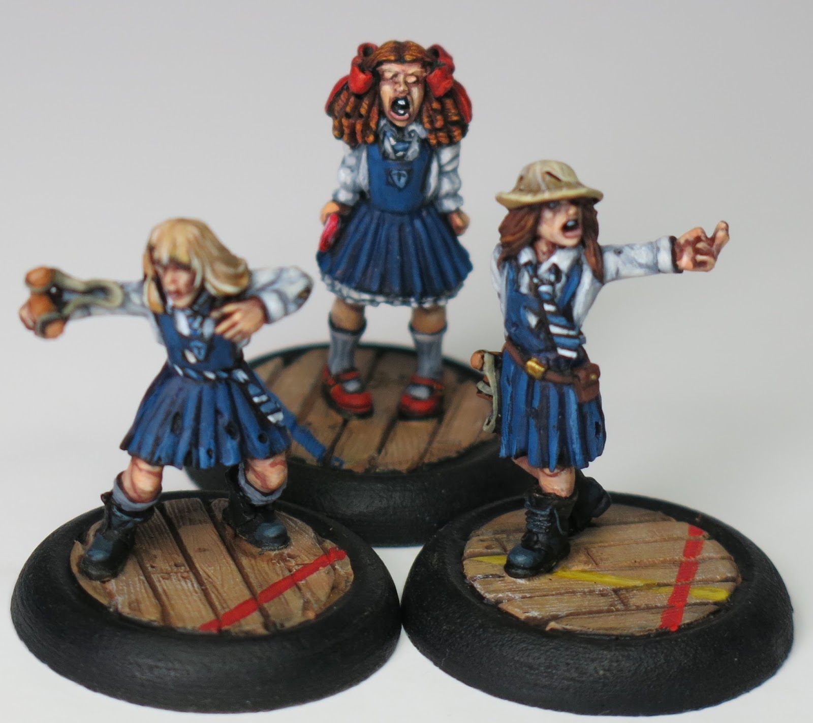
Following on from the 'Savage Schoolgirls' post, Bob Kinnear, of 'Bob's Zombie Apocalypse' fame had asked how I did the Zombicide Survivor Card for 'Violent' Elizabeth. I promised that I would try and put together a 'how to' for him and this is it! I was aware that the blank cards were available to download from the 'Zombicide' website, but it wasn't until I saw the 'Dark Templar's' efforts that I felt inspired to have a go myself. I should point out that his are done with photoshop and of course a considerable amount of knowledge and skill, but I am inherently lazy, not to mention mean, so were done using an online photo editing suite called 'Picmonkey'. I do like Picmonkey and use it a lot* so have paid for the full package, but I believe that what I am about to demonstrate can be achieved without any upgrade, you just have to put up with the adverts.
*the collaged photographs of my miniatures are done using it, for example.
First job is to download the blank Zombicide Survivor Card from here. It comes as a PDF, but you will need to save it as a JPEG in order to work on it in Picmonkey. Once saved on your computer go to www.picmonkey.com and click on 'Edit', this will allow you to select your blank Zombicide Survivor Card from your documents, or wherever you saved it.
Select the Butterfly(1.)(Overlays) icon on the lefthand tools bar, then click 'Your Own'(2.), which should in turn direct you to your photograph album, or the like, where you can simply select the character you want to work on. (Obviously if you haven't photographed your miniature this won't work!)
Click and drag the corner of your image(3.) so that it becomes the size that you want it to be, don't forget you will be adding text somewhere later, so bear this in mind.
Once positioned where you want it to be, select 'Hardlight'(4.) on the overlay panel. This is a personal preference and you can just as easily manage without it, I just like the way it looks.
Next select the 'Eraser'(5.) tool, but importantly change the 'Eraser hardness'(6.) to 0. This is important as it helps to soften the edge when blending the two images together and is what makes this method different from the sharper, 'cut out' appearance of photoshop; it is also what makes it quicker!
Once happy with the result it is time to add some text; simply click on the 'Tt'(8.) (Add Text) icon, then the 'Yours'(9.) button to discover the exact style font you need under the name of 'Cracked'.
Time to save! By pressing the 'Save'(12.) button at the top of the screen you will be guided through the process, including what quality you want, I would suggest the best (13.) as you are going to be printing these off.
That is very much that and once you've done your first one the subsequent cards will take no time at all. One final tip or suggestion though, save a version after you have successfully positioned and named your character and before you start adding the skills or actions. This is because when you save your card at the end of the process everything will be locked in, you won't be able to edit like you would a word document for example. By having a saved copy at this stage you will be able to use it as a template in case you ever what to change the attributes of your character. Good luck and let me know what you come up with!
 |
| The final card! |


